

Eatwise
(End to End Mobile App)


OVERVIEW
Role
UX/UI Designer
Duration
4 weeks
UX/UI Design, UX Research, Design Thinking, Task Flows, Personas, Wireframing
Methods
Tools
Figma, Miro, Whimsical, Calendly, Maze
Background
According to the most recent report by the charity Waste and Resources Action Programme (WRAP), the UK produced around 9.5 million tonnes of food waste in 2018. It is estimated that 70% of this total was intended to be consumed by people, with 30% classified as “inedible parts”.
Problem Statement
In the rise of the cost of living prices, more and more people are finding it difficult to cope in the new climate. People who are on lower incomes/in vulnerable positions tend to sacrifice the quality of food they are consuming; in order to keep up with the increasing prices of their bills.
Solution
Creating an app that helps reduce food waste by using the food users already have, whilst educating users of the nutritional and other ways they could help reduce their impact on the environment.
EMPATHISE
Competitive Analysis

French based recipe generator app. Decent UI and fairly straight forward usage. Even through it generated recipes for users, some users complained that the suggested meal were not accurate. The app suggested meals with ingredients the user may not have.
Also another recipe generator app. This app has a wide range of recipes, with a handy shopping list feature; which users can use voice input to add items to their list/search. However, there is a lengthy process before users can see possible recipes ideas; that contain all ingredients. First all ingredients have to be inputted into their pantry, then select the “Meal type”. Making it more time consuming.

This is a recipe app that has the feature to generate recipes based on what users input into the app. It has a simple layout and wide range of recipes to chose from, however users are limited to a max of 3 items when they use the recipe generator feature

Smartphone app and website that tracks diet and exercise. The app uses gamification elements to encourage adherence to exercise and diet goals. To track nutrients, users can either scan the barcodes of various food items or manually find them in the app's large pre-existing database. But there is no feature that generates recipes based on what the users already have.
During this analysis it was discovered that the main competitors for the type of product I was looking to developed, had the main function of users being able to generate recipes based on what they already had. However, they came with many limitations, such as restricting the user to a maximum item input, no access to content for none pro members, usability issues, and general lack of information.
Exploring the problem through user interviews
I interviewed 5 participants who were; aged 24-33 years, from various backgrounds & professions, & located worldwide.
To be honest I went into the research with the idea that the main reason people waste food was due to the lack of education/confidence in cooking and life style. So my questions were centred around the participants food habits, cooking ability, health, and the environment.
Findings

100% of participants waste food at least once per week; due to the majority from cravings & fridge organisation
“If I see someone eating something delicious I want it”
-Interview participant

100% of participants find that their financial situations plays a role in whether or not they choose healthy options
“It’s not whether if it’s healthy or not, it’s whether I can afford it”
-Interview participant

60% participants find it hard to come up with recipes with ingredients they already have at home
“It would be nice to have an app that tell what recipes I could make with my leftovers”
-Interview participant

40% of participants only felt confident when they were cooking for themselves, as they tended to cook the same things.
“I enjoy cooking food but I am still learning”
-Interview participant

80% of participants are aware of the phrase “Reduce, Reuse, Recycle” and care about the environment
“I try to live my life by the Food Recovery Hierarchy”
-Interview participant

60% of participants would like to get into composting
“Being more financially economic, seems like a really fun and feeling thing to do”
-Interview participant
DEFINE
Feature Roadmap
Features were decided upon, based on what competitors already had but also what the main USP of the app was. Which were:
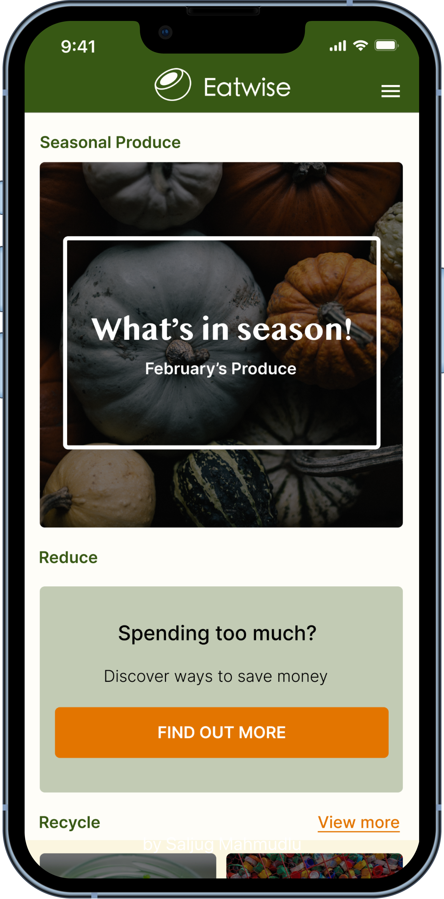
Recipe generator - based on what the user inputted (reuse)
‘Reduce’ section - helps users reduce the amount they purchasing during their grocery shop
‘Recycle’ section - provides ways in which the user could get rid of their food waste (by composting) and creative ways in which they can reuse items
5-a-day tracker - for users to aim for their daily nutritional allowance.
The 5-a-day tracker was chosen in particular, as the results show from the interviews; that when people hyper focused on their calories, macros, or other dietary values they developed unhealthy habits.
Sitemap
Then I drew up a sitemap, with the aim of creating a simple navigation layout for the app. Keeping in mind the main features and USP of the app.
Task Flows
I created three task flows that were centred around the three features of: Reuse (recipe generator), Recycle, and Reduce.
User Flows
But then I turned the task flows into a detailed user flow, to figure out which feature I wanted to focus on. I decided to concentrate on the ‘Reuse’ and ‘Recycle’ features; as these were the reoccurring problems that showed up in the user interviews.
IDEATE
Sketches
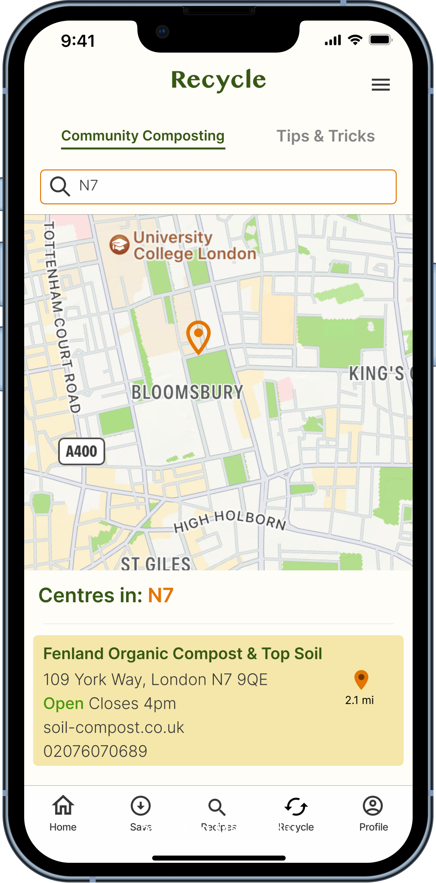
The sketches follow two journeys: Finding a recipe, based on ingredients inputted & Locating a community compost centre in their desired location.
Branding
Healthy
Inviting/Cosy
Friendly
Gentle
Earthy
Knowledgable
Brand Values
Colour Palette
Style Guide
PROTOTYPE
Hi-Fidelity Wireframes
The sketches were then brought to life incorporating the colour palette and UI components kit; which the combination gave birth to an inviting and down to earth wireframes.
Prototype
Flow 1: Finding a recipe, based on ingredients inputted
Flow 2: Locating a community compost centre in their desired location.
TEST
The prototype was tested on 5 participants fulfilling the requirements of the target audience.
This is what was found:

⅘ participants went to select the ‘Reduce’ icon in the tab bar when they were doing task 2. Most opted for ‘Reduce’ to be changed, as ‘Recycle’ fitted more with the content it housed

⅖ participants had a bit of trouble with the map screen; as there was little to no change once the results were generated.

All loved the design and general layout of the app, they felt that the colour palette, visuals worked well

Participants like the concept of the app; it something they would want and would find very useful to have
PRIORITY REVISIONS
Priority Matrix
Based on the feedback given during the usability tests; I decided to iterate the tab bar names and the centre results page, as these are crucial parts to the navigation on the app and where also the most common things participants had a problem with.
The ‘Reduce’ tab has been renamed to ‘Save’ & ‘Search’ to ‘Recipes’.
The search bar has been moved to the top section of the screen to increase it’s visibility and the height of the map had been reduced in order to expose more of the results list.


CONCLUSION
This is the project I am most proud of, as I feel like I have grown in my UX design skills. I was able to better plan what was need for this project and understand what direction I needed to take in order to accomplish the goal. On top I feel like I am able to design in a more refined, efficient, and consistent way.
That being said, having the experience with the Skinologic project, I felt comfortable if I needed to adapt to changes based on obstacles that arose during the process.
Confidence & UX Design
NEXT STEPS
Add a filter option for the generated recipes screen, so users can adjust their results based on what they are looking for ie dietary requirements
Contextualise the ‘Reduce’ section on the home screen, so it mirrors the structure of the ‘Recycle’ & ‘Recipes’ section
Add tutorial steps/infographics to guide users in how to use the app