Settle Up Feature

Overview
Role
Product Designer
Duration
4 weeks
Method
UX Design, UX Research, Double Diamond Process, Journey mapping, Wireframing
Tools
Figma, UserTesting
This piece of work was conducted as part of my internship, which gave me the opportunity to collaborate with other designers, copywriters, product managers and engineers.
What is Settle Up?
Settle Up allows users to securely send and receive money with friends and family, without the need to share sort codes or account numbers using a unique link.

The Problem
<0.17%
of payments to other Starling customers are made using the Settle Up Feature
On top of the relatively low feature utilisation, Starling’s customers have been regularly requesting feature improvements to the
Settle Up experience

Three Stage Approach
In an effort to address these points, I set out to improve the Settle Up experience in what would become a three phased approach. But due to the constraints mentioned I focused on phase 1, allowing for the foundations and groundwork to be built upon = a more feature rich experience in later phases.
1.
UI refresh and utilisation of current design system components and existing feature set.
Stage focused on for this project
2.
Expand on current feature set, based on prioritisation of impact and effort.
3.
Explore complex bill splitting, shared tabs and deeper social banking features.
Constraints
01
Time
4 weeks from concept through to high-fidelity design.
02
Scope
Focused on the more complex journey (Requestor via Transaction Detail view) due to time.
03
Design System
Leveraging existing design system whilst exploring evolution.
The Process
1
Discovery and research
2
Ideation &
concept development
3
User testing
4
Iteration
Phase 1
UI refresh and alignment with design system components utilising existing feature set

Where to begin…Defining our user
I first considered the different contexts in which users may experience whilst using the Settle Up feature.
This highlighted where I needed to focus my attention and dependent on how a user would pay the requester, I was able to treat the users’ experience slightly differently.
Requester

The user sending the request for money
Receiver

The user receiving the request for money. There are receivers fall into two subtypes – Starling customers and Non-Starling customers
User Journey’s
Non-Starling Users
Or user’s without the Starling App on their mobile device.


Starling Customers
Who have the Starling App on their mobile device.


Entry points for Requesters
Entry via Payments Hub Request Money

Entry via Transaction Detail page “Split this bill”
Wireframes Sketches
Whilst being mindful of the brief and constraints, I explored ideas for interaction patterns and components, empowering users to choose how they would like to split the bill. i.e how many people they would like to split the amount with.


Low-Fidelity Wireframes
The sketches that had the most potential were mocked up in Figma, to understand how they would look and behave.


Request Detail Screens
After a discussion with the team and Product Manager three directions with the most potential were increased into higher fidelity.
Components from the Starling Mobile Design System were utilised and the pages were structured as they would appear in the app.
Direction 1
Two-step


Direction 2
Slider

Direction 3
Stepper

End to End Journey
The New Design
Entry point (unchanged)

Feature onboarding (first time use only)


Feature activation (first use only)

Settle Up Amount Selection screen


Native iOS Share Sheet


Internal design team critique
In one of our weekly internal design team critiques, I presented the work I had been working on; explaining the flow and decisions that were made, before having a 7 minute silent critique to gain some valuable insights from the team.

Developing a user testing plan
After the internal critique with the design team, I worked to develop a research plan with questions aimed to uncover general usability performance, efficiency and comprehension.

Key points to test
5 participants on Usertesting.com
1.
Are users able to easily understand what the feature is offering, and is the user flow intuitive and user-friendly?
2.
Do users clearly understand that the split amount includes everyone, including themselves?
3.
Does it make sense for them to activate the Settle up feature? And if so, would they like the option to turn it off?
Synthesis of Insights
One insight stood out to me as it stated that the participant would rather use other apps for this kind of feature. So I added the question “What are 3 key characteristics of other apps you find easy to use and why are they important to you? ” This would allow me to understand what they deemed as crucial for an app to have.

The Outcome

4 out of 5 participants were able to complete the task without any guidance, bar one.
“It was super intuitive and super easy to do, I completely forgot about the tasks.”

4 out of 5 participants would use this feature again, expect one.
“I wouldn’t really use it again, as Monzo and Splitwise do a better job of this. It’s just a lot easier to use.”

Pre-calculating the split amount for each person was a feature testers loved.
“It’s genius that it does the split for you, I don’t need to waste time having to do it myself.”
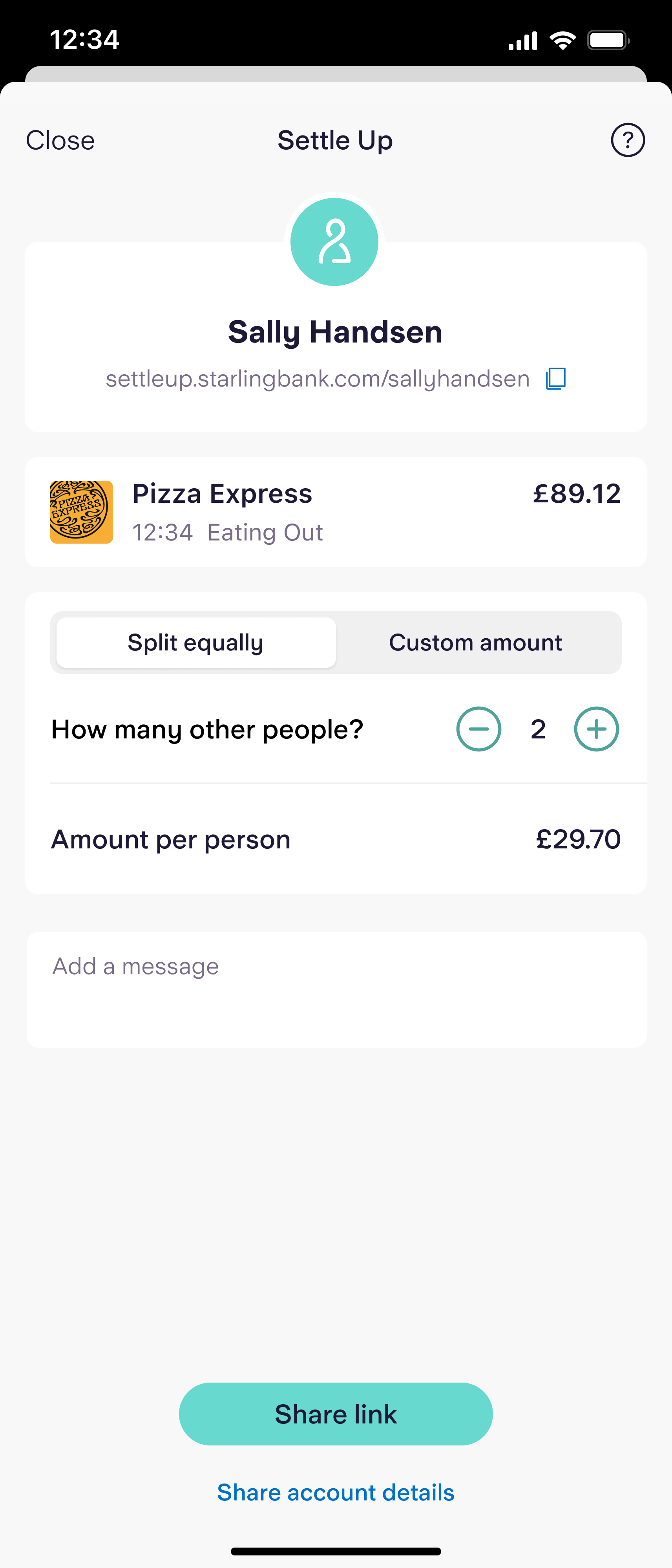
The Chosen One
After a lot of exploration looking at various components on how to handle this elegantly – I landed on the segmented control. This allows the user to toggle between Splitting equally, or alternatively entering a custom amount to request and also a copy icon to the users details, so that the user knows that they can share their unique link.
This functionality was already there on the left version; it's just wasn't clear that it was there to the user – so by adding the icon we gave clearer affordance to the ability to copy this link directly to your clipboard.


Iterations
Based on internal critique and user-testing

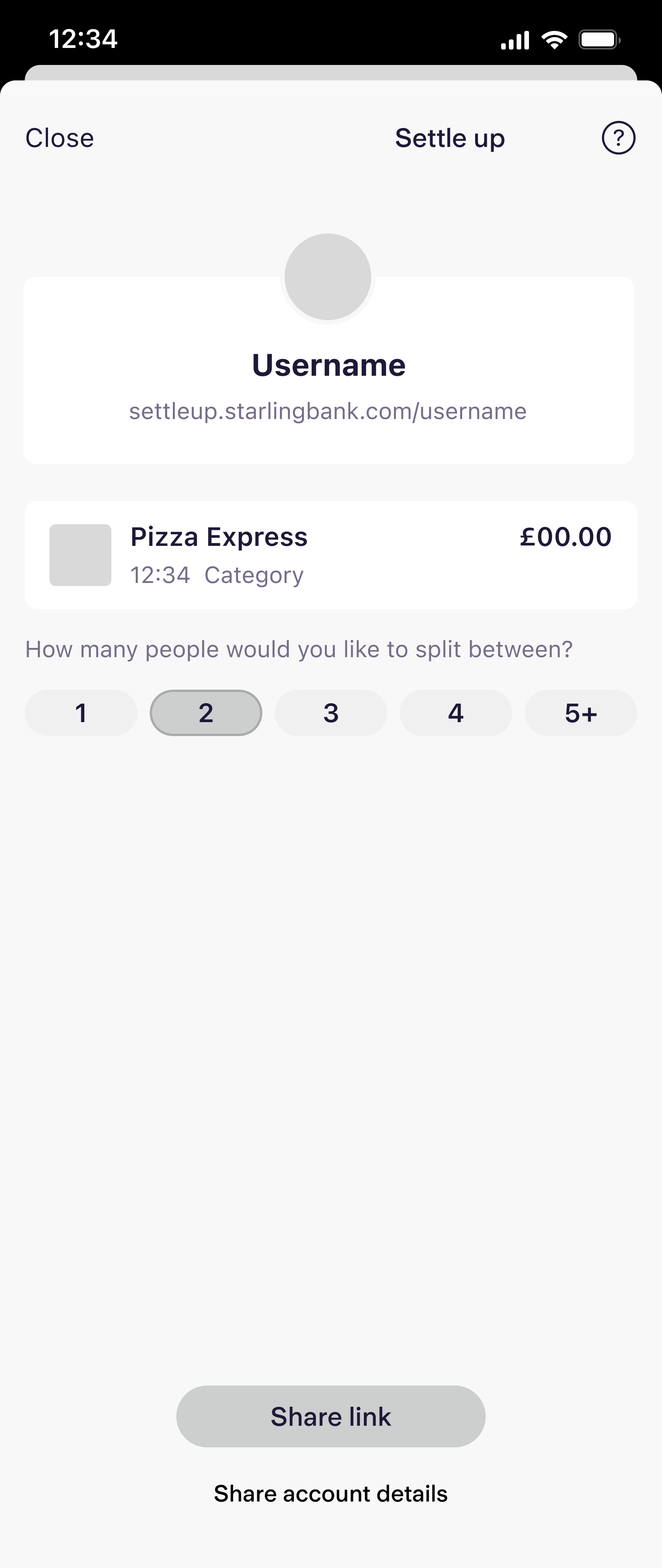
I kept getting stuck on how could we communicate clearly to the requester that the split amount calculation includes themself (the user).
Version 1
The Challenges

Didn’t help with the confusion of whether or not the requester is included in the split amount calculation, version 1 “with 2 people” it doesn’t communicate clearly whether that includes the requester and one other person or 2 other people.
Version 2

So I thought let's break it out in order for the user to clearly see who will be involved in this calculation, as shown in version 2. But this didn’t really work either because say the user inputs 10 people, they would need to scroll back and forth; which in itself is not the best user experience.
Old vs New
Side by Side
Old

New