

Hinge
(Adding a new Feature)


OVERVIEW
Role
UX/UI Designer
Duration
4 weeks
Method
UX Design, UX Research, Design Thinking, Storyboarding, Task & User Flows, Personas, Wireframing
Tools
Figma, Miro, Whimsical, Calendly, Maze
Background
Due to the pandemic people’s views on dating have changed. People are more open-minded in how they utilise dating apps to meet other users and are more specific in who they meet up with; based on if they “fit” their requirements. So finding companionship is taken more seriously, as long-term serious relationships are on the rise. According to the Times “83% of UK users would prefer to date someone in therapy and 52% of users prefer “sober dating” (i.e. going for a drink is no longer the ideal first date).” And a recent survey from Match has shown that “69% of users in the US were open to video chatting with a potential partner, whereas just 6% had tried it before the pandemic.”.
Founded in 2015 by Justin McLeod. Hinge is "The dating app designed to be deleted". The app emphasises on long-term connections between users. Aimed towards a younger demographic than Match.com and Harmony, such as the demographic using Tinder.
Problem Statement
People are finding it difficult to make long-lasting authentic connections via dating apps, as a lot of it is built on superficial ideologies. So I would like to add a feature to Hinge’s dating app in order to improve dating success and allow for more meaningful connections to be made.
Solution
Adding a feature that allows users to filter out other users who don’t share the same hobbies/interest.
EMPATHISE
User Interviews
I interviewed 5 participants aged 27-41 years old, from an array of backgrounds who also used dating apps. I was able to decipher the insights into an affinity map; that helped highlight the most pressing problems users faced during their use of online dating apps.
Findings

100% of participants found that they were exposed to too many choices and were not able to filter properly, making it difficult to chose one person to commit to
“It would be great to get married”
-Interview participant

“You could be the thing since slice bread, but it doesn’t matter; as you don’t fit their schedule”
-Interview participant

80% of participants were looking for a long-term relationship with meaningful connections or the “one”
“There are certain personalities I glue with, others that wind me up. So I need to know!”
-Interview participant

Meeting someone online does raise safety concerns as 100% of participants recognised that they are ultimately meeting a stranger for the first time.
100 %Participants prefer to use the basic features that come with the standard free membership; e.g. video calling, questionnaires etc, as they found that the paid features are not useful or worth the payment.
“I would message a friend the full plan of the date, just in case”
-Interview participants
Lack of information provided about other, made it difficult to find out more about the person of interest.

“The paid features doesn’t make a difference, so I don’t use them”
-Interview participants
DEFINE
Personas
From these insights two personas were created;
And then we have Theodore, who wanted only to have causal interactions and meet like minded people.
Task Flows
I looked at two task flows for this feature, one that focused on adding hobbies to your profile and the other that looked at the flow of users filtering their search results based on what hobbies they were interested in.
User Flows
I then went through Hinge’s app to see all the possible avenues users could take in order to reach the goals mentioned in the task flows. This allowed me to identify where would the hobby feature work best within Hinge’s flow.
We have Nwai, who had the goal of finding a long-term relationship through an organic situation.
IDEATE
Storyboarding
Creating a storyboard helped me figure out where to place the new feature and where it would make the biggest impact on the app/dating journey.
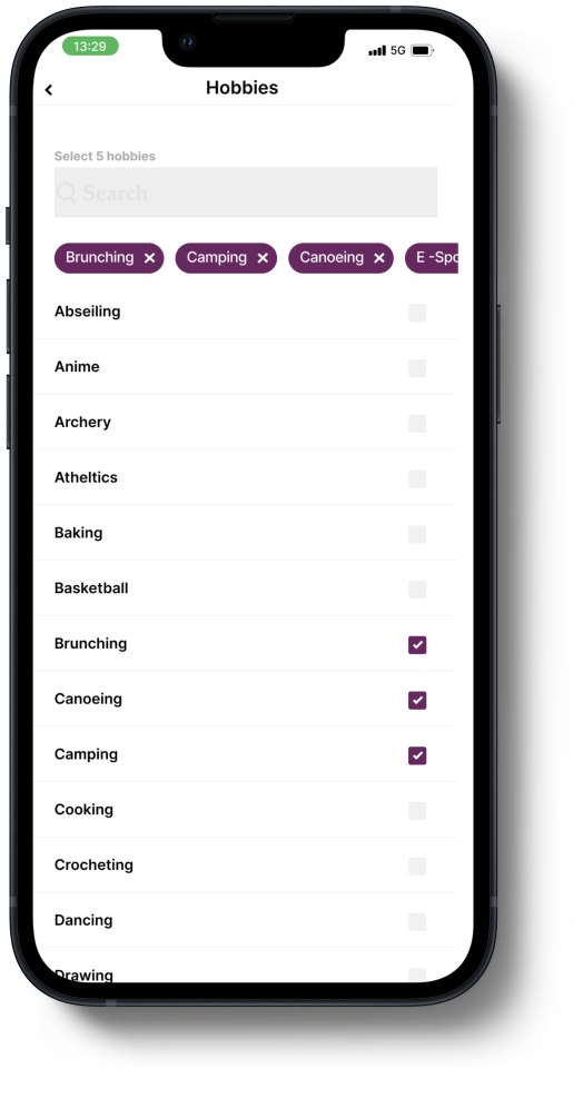
Low-Fedility Sketches
From this I focused on creating sketches of what the filtering screen would look like, where to place it on the Hinge’s discovery screen; so the profile of each user. Whilst also mimicking the same design and flow patterns Hinge already has.
PROTOTYPE
Hi-Fidelity Wireframes
These was then upscaled into high quality wireframes, enabling me to see whether my designs marinated well into the designs/patterns that were already there.
Prototype
From there I pieced together all the necessary screens together to form a prototype that resembled the two task flows mentioned prior.
Flow 1: Adding hobbies to profile.
Flow 2: Filtering search results by hobbies.
TEST
Usability Test Results
After assessing the results from the usability test, this is what I found:

75% direct success rate for task one and a 71% direct success rate for task two. Telling me that the flow for the feature is well placed.

That being said there was over 89% mis-clicks on the ‘Hobbies selection screen’ and over 14% mis-clicks on the ‘Discover screen’ and over 50% of mis-clicks on the ‘Edit profile screen’ .

Overall responsiveness problems with certain areas of these screens, were identified. For instance there were multiple clicks to the search box, back and exit icons, also to the avatar icon in the navigation bar at the bottom of the screen.

To add, one participant mentioned that they got a little confused as there was nothing to confirm/save the changes made to their filter options.
PRIORITY REVISIONS
Iterations
Amendments were made in the areas that cause most of the issues within the prototype. I realised the main problem that caused the most issues were not having active areas and a big enough hit area for icons. The red rectangles signify where I either increased the hit area or where I made active, in order for users to interact with it.


That being said, even though this doesn’t follow the design pattern Hinge already has in place, I also added two CTAs to confirm the choices made on the filter screen. This could help with reducing the amount of mis-clicks found on this screen, as this would be able to indicate and guide users onto the next steps of the journey.
CONCLUSION
Prototype
Even though prototypes are not the complete product; you have to create them with in mind all the possible routes participants could take when testing the product. Hit areas are important for responsiveness.
Designing with brand constraints
Overall, when it comes to designing a feature for a brand that is already established you have to stay within the guidelines that already have been set. So this can be a little limiting but also it has allowed me to uncover new aspects of the app that may be useful and even enhance the user experience.